Aisera, an AI-powered hub, empowers employees to converse with a copilot to resolve issues efficiently.
As Aisera expanded its presence into the Middle Eastern and Israeli markets, we identified the need to introduce right-to-left (RTL) language support for our Copilot feature.
The goal was to create a seamless experience for users who read and interact with products in RTL languages, such as Arabic and Hebrew.

Team.
A team of 2 Designers and a Design Manager.
Role.
My role involved conducting research and leading several UX exercises, such as dot-voting and card sorting. I also created initial wireframes, gathered feedback, and developed the initial version of the Figma files.
Seamless Interface for Right-to-Left Languages

Please contact me for high-fidelity designs and more details on this project!
volhadouban@gmail.com

Overall layout.
The entire layout and text direction adapt for RTL, with user chat bubbles repositioned to the left and bot responses to the right. Additionally, the logo and main navigation shift to the opposite corner with the navigation elements inside also mirrored, ensuring a consistent and intuitive experience.


Buttons and numbers.
Elements such as timestamps, phone numbers, clock displays, website URLs, and untranslated text remain unaffected and do not switch directions in RTL interfaces. However, the order of buttons undergo changes to accommodate the right-to-left layout.
Forms and arrows.
Form layouts and their elements are mirrored. Directional icons, such as arrows, sound on/off are also flipped to maintain consistency with the mirrored interface. Passwords remain unchanged, but the input field aligns to support right-to-left typing.


Calendar.
Months toggle arrows are repositioned to the opposite corner, so clicking the left arrow will display the next calendar month. For instance, if the current month is April, clicking the left arrow will show May. The date format also changes to start with the day, following the format DD/MM/YYYY.
Scroll bar switches positions, and the order of years adjusts to RTL, while maintaining a top-to-bottom direction.
Logos.
The logo never gets flipped as it confuses people and might have legal consequences.

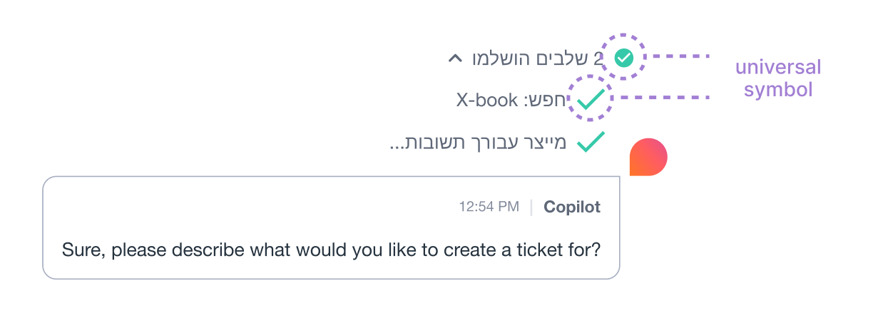
Universal signs.
Universal symbols and markers are expected to maintain a consistent appearance. As a general guideline, icons representing real-world objects should remain unflipped.
Part 2: Settings to switch between LTR and RTL.
Once the RTL rules were understood, it was time to design the settings menu that would allow users to switch to RTL support. Since the settings menu had not been designed yet, I scheduled a meeting with another designer on the team and a design manager to brainstorm the requiremebnts for the settings menu.
I led a dot-voting exercise, where each of us listed potential features and then used dots to vote on which ones to prioritize. Following that, we used a card-sorting exercise to group the options within the settings menu.

At this point we needed to move fast, so I quickly sketched several different directions for the settings menu, exploring a couple layouts to ensure the most intuitive and efficient design. Afterwards, I reviewed the designs with the team to get some feedback and moved forward with the initial prototype in figma.

Collaborating with Engineering.
Once the initial designs were completed, I organized a design feedback with the team to review the proposed directions.
After minor modifications, I handed off the designs to another designer on the team, who worked on preparing the files for the engineering team.

Under NDA. Please contact me for designs and more details on this project!
volhadouban@gmail.com
Want to see more?
Explore other designs